CSS frameworks can make web developer's life a lot simpler, by providing a skeleton or starting point for styling webpages. Frameworks can take the hassle out of creating custom stylesheets and can save you time by pre-compiling styles into reusable modules.
They come in a variety of formats, such as compiled files and JavaScript modules that can make your work easier. They allow you to create custom structures and styles for your web pages, making them look unique and professional.
It's important to choose the right CSS framework for your project, so be sure to read our top CSS frameworks before making a decision.
CSS frameworks are becoming more and more popular as web designers look for ways to speed up the design process. In this article, I will review the top 10 CSS frameworks of 2022
Top CSS Frameworks in 2024
1 - Tailwind CSS
- ⭐
Speedy - ⭐
Easy to use - ⭐
Flexibility - ⭐
Scalability - ⭐
Customizable - ⭐
Efficient
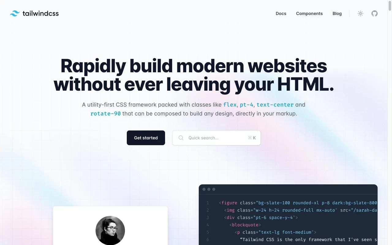
TailwindCSS is a powerful, responsive CSS framework that makes creating layouts and designs for desktop and mobile devices easy. Tailwind provides a number of pre-built classes and variables to help speed up development, as well as a built-in media query engine that makes adjusting layout based on device size simple. Tailwinds are a collection of CSS rules that help you create responsive designs quickly and easily.
Tailwind CSS comes first in top CSS frameworks. It's designed to help you quickly create DRY, composable CSS. The best part is that it doesn't require a preprocessor, so you can use it right in your HTML file. It offers 1000s of colors, presets, and components to help you get up and running quickly.
I have found Tailwind CSS to be very helpful in quickly and easily styling my web pages. It's helped me to quickly and easily create responsive designs that look great on all devices.
- Speed up your web development process
- Automatic responsive design
- Optimize your images for faster loading times
- Easy to use and learn
- Free and paid plans available
- It can be challenging to debug
- It can be hard to find help online
- It can be expensive to use
- There can be compatibility issues with different browsers
I have learned CSS basics first to quickly get into Tailwind. But this can be a pain for beginners but for users with CSS knowledge, it is the best CSS framework. Utility classes are named on CSS properties so you got to learn CSS first to use this one.
2 - Bootstrap CSS
- ⭐
12-column grid system - ⭐
includes prebuilt components - ⭐
Responsive and mobile-friendly - ⭐
Allows for easy customization
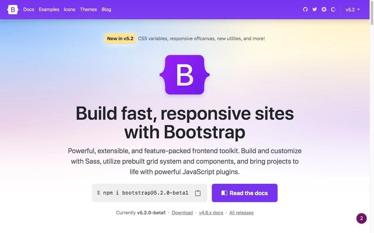
Bootstrap is a popular open-source CSS framework. Bootstrap has been around since 2011, and it continues to be one of the top CSS frameworks. It gives you the ability to quickly create responsive websites that look great on all devices. Bootstrap also provides a library of reusable components, which makes it easy to build complex layouts. Bootstrap is free to use and available on GitHub.
Bootstrap provides a minimal set of CSS and JavaScript files that you can use to create a custom design for your website or app. Bootstrap makes it easy to create a consistent design throughout your project while providing useful features like grid systems and flexible typography options. With Bootstrap, you get a well-organized structure and a set of ready-to-use components that make your job easier.
When I didn't have much experience with responsive design or web development, at that time Bootstrap was a great way to get started.
- helps you create responsive websites
- It is open source and free to use
- makes it easy to create a consistent look and feel for your website
- gives you access to a huge library of components and utilities
- May not be suitable for all types of websites
- Can be limiting in terms of design
- May not be as up-to-date compared to other frameworks
- May not be as customizable as other frameworks
Just bootstrap documentation and knowledge of class names. That's all you need to get started.
3 - Materialize CSS
- ⭐
Speed and performance - ⭐
Responsiveness - ⭐
Ease of use - ⭐
Customizability - ⭐
Browser compatibility
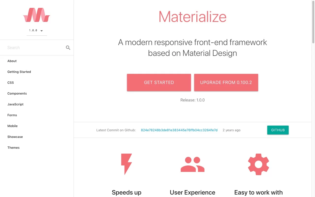
MaterializeCSS is a free online resource that helps you create responsive websites using the Material Design style guide. The website offers easy-to-use tutorials, tools, and resources that make it simple to get started with Material Design.
One of the best things about MaterializeCSS is the wide range of templates and themes that are available for free download. You can find templates for everything from landing pages to ecommerce stores, and there are plenty of options to choose from.
MaterializeCSS.com also offers a number of handy tools and resources, including a code editor, a component library, and a design kit. The code editor is especially useful because it allows you to experiment with different design options without having to write any code.
- quickly create responsive websites
- easy to incorporate animations and transitions
- uses modern technologies like HTML5 and CSS3
- gives your website a more polished look and feel
- It has limited browser support
- Lack of flexibility
- Can slow down a website's performance
- using grid can be a bit more complicated
- Inefficient code
When it's about mobile-like UI (android) design, Go for Materialize. It's called Materialize for a reason and is considered the best CSS framework for app-like website design.
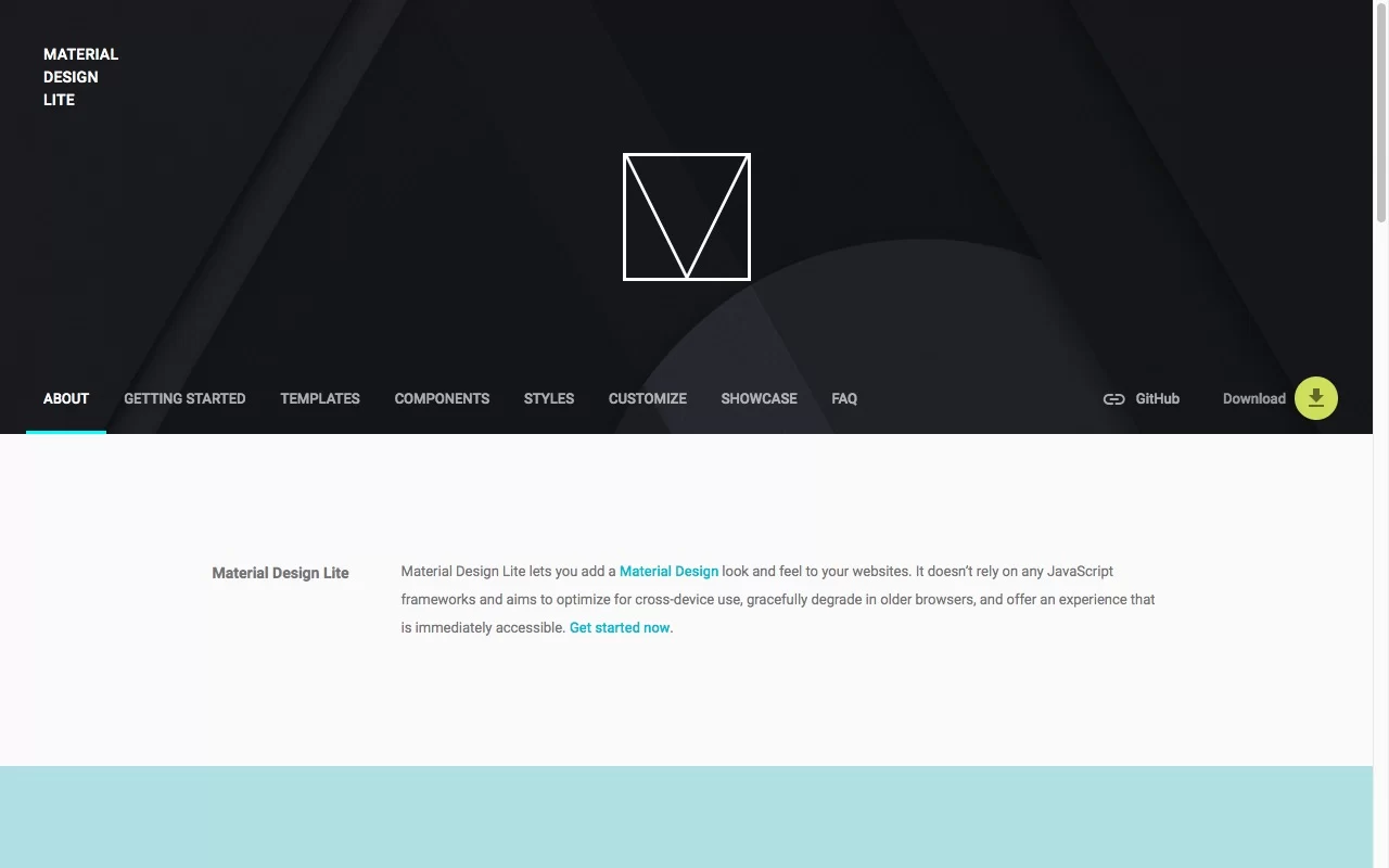
4 - Material Design Lite
- ⭐
Create clean and minimal design - ⭐
Customizable interface - ⭐
Easy to Use - ⭐
Responsive and Mobile-Friendly - ⭐
Optimized for Performance - ⭐
Cross-Browser Compatibility
Material Design Lite (MDL) is a library of components for web designers that adhere to Google's Material Design guidelines. It's a great option for responsive design because it includes Sass variables and mixins, as well as JavaScript plugins. MDL also has a grid system and an extensive list of components to choose from, so you can create custom designs without starting from scratch.
It has a library of components that helps developers create websites that follow Google's Material Design Guidelines. When using MDL, you don’t have to create all the necessary components yourself. It has a library of components such as buttons, checkboxes, and tabs that can be used in your projects to create beautiful user interfaces.
You can also customize these elements to match your specific needs. Material Design Lite is easy to use and can be integrated into any website. I'd recommend giving one of the top CSS frameworks, Material Design Lite, a try who need a quick way to add some polish to your project.
- simple and lightweight framework
- fast to load on any device
- library provides a wide range of UI elements
- constantly updated by Google
- follows the Material Design guidelines
- Lack of support for older browsers
- Limited flexibility & customization
- Could not be used for large projects
- No support for RTL languages
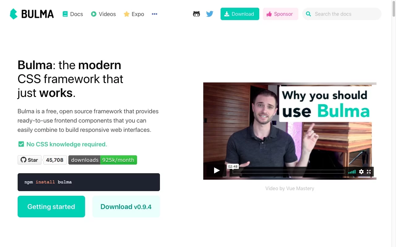
5 - Bulma CSS
- ⭐
Responsive grids, flexbox components - ⭐
Versatile and customizable - ⭐
Made up of variables, mixins, nesting - ⭐
Wide range of built-in components
Bulma is a CSS framework that was created by Jeremy Thomas. This CSS framework is based on Flexbox. It's simple to use and provides everything you need to get started with responsive web design. Bulma is also modular, so you can include only the features you need.
This top CSS framework is designed to be lightweight and mobile-friendly. Bulma also includes a number of features that are not found in other CSS frameworks, such as the ability to create circular progress bars and animated text shadows.
The goal of Bulma was to provide developers with a grid system and components that were flexible, lightweight, and modern. Bulma is responsive, which means that it will adapt to different screen sizes. It also uses Sass, which makes it easy to customize.
I have found that it is also very easy to customize, Bulma to fit my needs.
- lightweight, which makes it faster to load
- easy to customize
- Based on Sass, which makes it more powerful than traditional CSS
- Regular updates that keep the framework up to date
- Quite complex to use
- Doesn't always work well with older browsers
- Difficult to debug
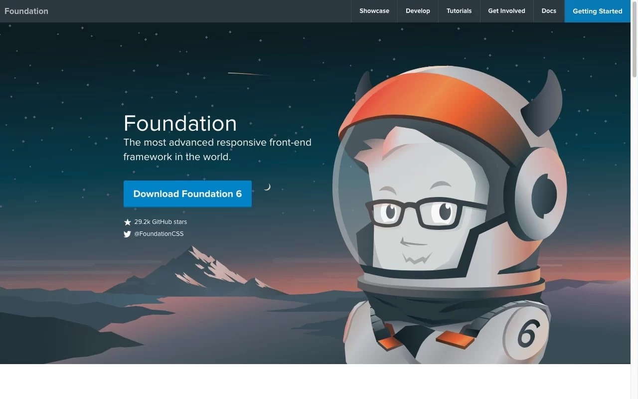
6 - Foundation
- ⭐
Create responsive websites. - ⭐
Customizable - ⭐
Provide website a consistent look and feel
Foundation provides a responsive grid system, easy-to-use typography and basic styling for common HTML elements. By using a CSS framework like Foundation, web developers can spend more time focusing on the functionality of their websites, and less time worrying about their appearance. This makes Foundation a good choice for mobile websites and one of the top CSS frameworks.
Foundation also includes built-in navigation menus and other features that can be used to create complex layouts. It has a grid system that makes it easy to create layouts, and it includes many common styles that you can use as a starting point for your own designs.
I have used Foundation and it has created layouts and includes some basic styling for common elements such as buttons and headings.
- Optimized for performance
- Faster to load
- Development process simpler and more efficient
- Reliable and versatile
- Wide variety of components
- Limited in the design options
- Could be difficult to learn and use
- A bit difficult to customize
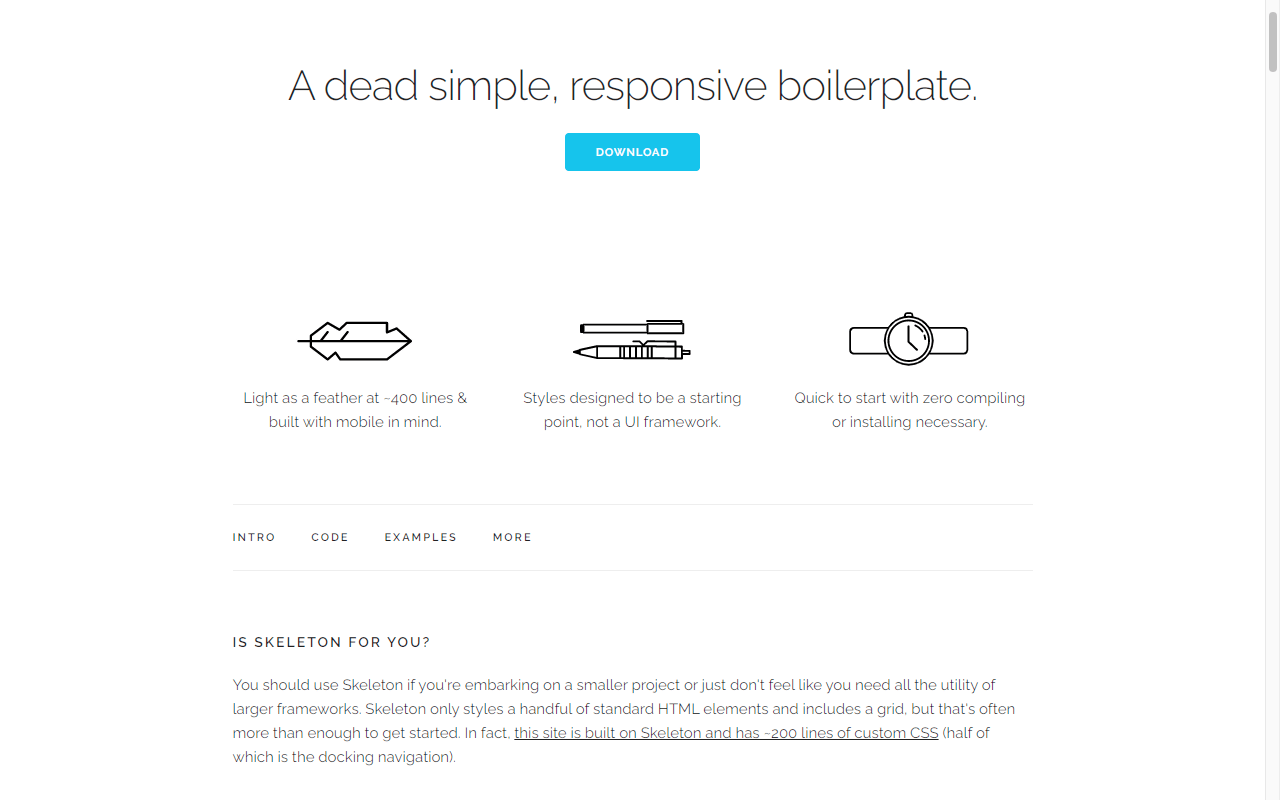
7 - Skeleton
- ⭐
Responsive design built-in - ⭐
Provides a grid for your layout - ⭐
Quickly create prototypes and production-ready code - ⭐
Well-tested and maintained features and plugins
Skeleton is a simple, responsive CSS framework with a small footprint. Skeleton includes everything you need to get started with responsive web design. It has a 12-column grid, sensible typography, and easy-to-use components. It's perfect for rapid prototyping and small projects. Skeleton is open source and available on GitHub. It has a minimal number of rules, and its grid system makes it easy to create layouts that are both responsive and mobile-friendly.
It's perfect for quickly building prototypes and small projects. Skeleton's grid system is based on percentages, so it's fully responsive. The default font size is also responsive, so it will automatically adjust to different screen sizes. You can also change the font size manually if you need to. Skeleton comes with a few basic styles for common HTML elements, like headings, paragraphs, and lists.
You can also add your own custom styles if you need to. Additionally, because Skeleton is so lightweight, it doesn't add any extra load time to my pages which is really important to me.
- Responsive
- Lightweight and easy to use
- Cross-browser compatible
- Sass-based framework
- Time-consuming and challenging for beginners
- Could not handle different screen sizes
- Does not include any design files or any JavaScript components

8 - Semantic UI
- ⭐
It has a great grid system - ⭐
Provides clean and modern design - ⭐
Variety of components
Semantic UI is a popular CSS framework that helps you create beautiful, responsive websites. It's based on semantic markup, which makes it easy to use and understand. Semantic UI also includes a number of built-in components, so you can get started quickly.
Semantic UI is a semantic CSS framework that aims to make web development more intuitive. Semantic UI comes with ready-made classes for common HTML elements, so you can build complex interfaces without having to write a lot of custom CSS. Semantic UI also includes a powerful responsive grid system that makes it easy to create fluid layouts.
Semantic UI treats HTML as a design language, not just a way to display content. This makes it an ideal choice for creating modern web applications and one of the top CSS frameworks. Semantic UI is well-tested and has been used in production on high-traffic websites.
- Responsive
- easy to use
- Open source
- Easy to customize
- Limited design options
- Complicated codebase
- Poor cross-browser compatibility
- Steep learning curve

9 - Pure CSS
- ⭐
Flexible grid - ⭐
Media queries - ⭐
Optimized for performance
Pure CSS is a technique for styling web pages using only CSS. By using pure CSS, you can avoid using JavaScript or other technologies to style your pages. This can make your pages faster and more responsive. Pure CSS is a set of properties and values that allow you to style HTML elements without needing to use JavaScript or images.
Pure CSS can be used to create everything from simple text effects to complex animations. With pure CSS, all the styling is done in the browser, so there is no need for additional files that need to be downloaded. Pure CSS is that it makes one of the top CSS frameworks. Overall, I've found Pure CSS to be an indispensable tool for creating responsive websites quickly and easily.
- Customizable
- Ease of use
- Community support
- No pre-built components
- Poor documentation
- Difficult to learn
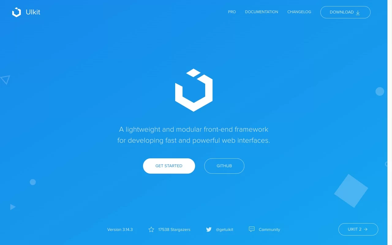
10 - UI kit
- ⭐
Various user interface elements to create a polished and professional interface - ⭐
Library of reusable components - ⭐
Ensures consistency across different screens
A UI kit is a collection of user interface elements that allow for rapid development of user interfaces. They can include buttons, text fields, checkboxes, and other common interface elements. A UI kit can help speed up the design process by providing a library of pre-made elements to work with.
If you're looking for a quick and easy way to create a user interface, a UI kit is the perfect solution. Templates and components make it easy to design your interface, while pre-written code makes it easy to write the code necessary to bring your design to life.
- Design flexibility
- Improved workflow
- Increased productivity
- Easier collaboration
- Difficult to customize
- Inefficient use of space
FAQs
Are learning the CSS framework necessary?
If you're just starting out and don't have any experience designing websites, a CSS framework may be a good option for you. A well-organized and standardized CSS framework can definitely help streamline your project.
Why use the CSS framework?
CSS frameworks help you organize your code, make it easier to read and maintain, and can reduce the amount of time you spend coding.
When you should not use a CSS framework?
When you're not familiar with the library's features yet, you need to customize it for your project, you need more flexibility in your design, and you can create a similar layout using simpler methods.
Do you really need a CSS framework?
There are some pros and cons to using a CSS framework, so it's important to weigh them before making a decision.
Is using a CSS framework cheating?
CSS frameworks can be a great way to speed up the development process and save time by providing pre-made designs for common website elements. Ultimately, how you design your website is up to you.
Conclusion
CSS frameworks are an important part of web development. They make it easy to create a well-designed website with a consistent look and feel. As more and more people use them, the quality of CSS frameworks continues to improve. Each framework has its own benefits and drawbacks, so it's important to choose one of the top CSS frameworks that best suits your needs.
Hopefully, this article has helped you make a decision about which framework to use for your next project.