If you have been creating layouts with CSS for a while you must have begun with display: block; float: left; properties, in the beginning, There were many problems with this legacy method. Floating boxes were messy and had height problems, we had to add a couple of overheads to fix the clearing of floats.
With the introduction of flexboxes, It fixed many of the problems with one-dimensional layouts. Its algorithm takes care of the most common problems with float box layout models. Flexbox can solve uneven height problems along with space distribution and alignment problems. Just by learning how to use the display flex property, we can solve the most common layout problems just by defining the flexboxes.
The Flexbox concept adds the ability to distribute, align, alter and fit parent's immediate child items. Flexbox or Flexible Box aims at providing a better and more efficient way to do CSS layout. Flex container expands / shrinks so that immediate child items have available free space. Flex child has the ability to align itself and ability to change orientation, resizing, stretching, shrinking.
Flexbox is suitable for smaller one-dimensional layouts like cards, for managing complex and large scale layouts, CSS Grid model is more useful as it works on two dimensions and is more flexible for the layouting job.
The Basics of Flexbox
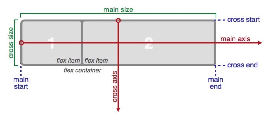
Flexbox terminology diagram from official W3C specification.
- main-axis: x-axis across which all the flex child items are laid out. The direction is based on the flex-direction property.
- main-start | main-end: Starting and ending points of the container. Flex child items are placed within the container from main-start to main-end.
- main size: This defines the main size of the flexbox. It can be either width or height depending on which is the main size.
- cross axis: y-axis or perpendicular axis to the main axis. Its direction depends on the main axis direction.
- cross-start | cross-end: Flex lines are filled with items and placed into the container starting from cross-start to cross-end side.
- cross size: The width or height of a flex item, whichever is in the cross dimension, is the item's cross size.
Flexbox Syntax:
.parent{ display:flex; }
Just by using display property, flexbox can be enabled. Flexbox doesn't just work with display property, It has another set of properties for containers and its immediate child. We can use these flex properties of flexbox to fine-tune the layout.
The flexbox properties are applicable for the Parent and Children:
Properties for the Parent (flex container)
display:
This defines a flex container; inline or block depending on the given value. It enables a flex context for all its direct children.
flex-direction:
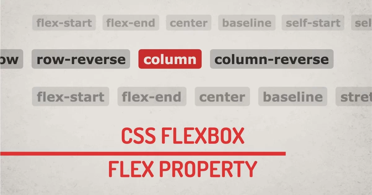
This defines the main axis for the flexbox. Flex Direction defines flex-flow in one direction. Possible values are row, row-reverse, column, or column-reverse.
- row: aligns child elements left to right in ltr; right to left in rtl
- row-reverse: aligns child elements right to left in ltr; left to right in rtl
- column: aligns child elements one after another from top to bottom
- column-reverse: aligns child elements one after another from bottom to top
Switching flex-direction also switches the main and cross axis of the flex container.
flex-wrap:
Flex child tries to align in one line without wrapping by default. Possible values for flex-wrap are nowrap, wrap, wrap-reverse
- nowrap: aligns all flex items in one line
- wrap: aligns items onto multiple lines if no space is available, from top to bottom.
- wrap-reverse: aligns items onto multiple lines if no space is available, from bottom to top.
flex-flow:
This is a shorthand for the flex-direction and flex-wrap properties, The default value is row nowrap. Valid values for flex-flow are all the values for flex-direction and flex-wrap.
justify-content:
This defines the alignment along the main axis. Justify-content distributes extra space in various ways. Possible values for the properties are: flex-start, flex-end, center, space-between, space-around, space-evenly, start, end, left, right, safe, unsafe;
- flex-start: items are aligned toward the start of the flex-direction.
- flex-end: items are aligned toward the end of the flex-direction.
- start: items are aligned toward the start of the writing-mode direction.
- end: items are aligned toward the end of the writing-mode direction.
- left: items are aligned toward the left edge of the container, unless that doesn’t make sense with the flex-direction, then it behaves like start.
- right: items are aligned toward the right edge of the container, unless that doesn’t make sense with the flex-direction, then it behaves like end.
- center: items are aligned centered along the line
- space-between: items are evenly distributed in the line; First and Last elements has no space at the beginning and at the ending.
- space-around: items are evenly distributed in the line with equal space around them. This doesn't mean all the items will have equal space, First and Last, Elements will have a single unit of space, all in between elements will have 2 units.
- space-evenly: items are distributed so that the spacing between any two items is equal. This value truly adds even space to all elements.
All the property values of justify-content are yet not fully supported. The safest values are flex-start, flex-end, and center.
There are also two additional keywords we can pair with these values: safe and unsafe.
align-items:
This defines the default behavior for how flex items are laid out along the cross axis on the current line. This is justify-content behavior for the cross-axis. Possible values for the align-items are stretch, flex-start, flex-end, center, baseline, first baseline, last baseline, start, end, self-start, self-end + safe/unsafe
- stretch: stretch element height to fill the container.
- flex-start / start / self-start: items are placed at the start of the cross axis.
- flex-end / end / self-end: items are placed at the end of the cross axis.
- center: items are aligned centered in the cross-axis.
- baseline: items are aligned such as their baselines align.
The safe and unsafe modifier keywords can be used in conjunction with all the rest of these keywords.
align-content:
This aligns a flex container’s lines within when there is extra space in the cross-axis, similar to how justify-content aligns individual items within the main axis.
Valid value for align-content is the same as justify-content: flex-start, flex-end, center, space-between, space-around, space-evenly, stretch, start, end, baseline, first baseline, last baseline + safe/unsafe
- normal: items are aligned in their default position as if no value was set.
- flex-start / start: items aligned to the start of the container. The (more supported) flex-start honors the flex-direction while start honors the writing-mode direction.
- flex-end / end: items aligned to the end of the container. The (more support) flex-end honors the flex-direction while the end honors the writing-mode direction.
- center: items are aligned centered in the container
- space-between: items evenly distributed; the first line is at the start of the container while the last one is at the end
- space-around: items evenly distributed with equal space around each line
- space-evenly: items are evenly distributed with equal space around them
- stretch: lines stretch to take up the remaining space
The safe and unsafe modifier keywords can be used in conjunction with all the rest of these keywords.
Properties for the Children (flex items)
order:
This Defines the order in which flex items are displayed inside the container. Order will change the position of items irrespective of how it is defined in HTML. If more than one element has the same order value, one that is defined first in HTML will get the priority.
flex-grow:
This defines if the flex item should grow if required. It accepts a positive unitless value that serves as a proportion. It defines how much space an element should take from available space inside the flex container.
If all items have flex-grow set to 1, the remaining space in the container will be distributed equally to all children. If one of the children has a value of 2, the remaining space would take up twice as much space as the others.
flex-shrink:
This defines the ability for a flex item to shrink if necessary. It accepts a positive unitless value that serves as a proportion. It defines how much an element should shrink compared to its adjacent elements.
flex-basis:
This defines the default size of an element before the remaining space is distributed. We can think of this property as a width or height depending on how it is used. It accepts valid width values with all supporting width units. If its value is 0 then no additional width is calculated. If it's auto, extra space is distributed based on its flex-grow value.
flex:
This is the shorthand for flex-grow, flex-shrink and flex-basis combined. The second and third parameters flex-shrink and flex-basis are optional. The default value is 0 1 auto. It's better to use shorthand properties than consequent properties.
align-self:
It allows the default alignment to be overridden for individual flex items.
It accepts auto, flex-start, flex-end, center, baseline, stretch. Flex item is not affected by float, clear and vertical-align.
Responsive Web Design (RWD) With Flexbox:
The easiest way to use flexbox to do a responsive layout is just by changing flex-direction. It's easy to switch complex layout to single column layout using flexbox. We can change the flex-direction inside the media query to switch the layout.
Using Flexbox with HTML Elements
If you're familiar with other layout techniques such as floats, margins, and tables, then you probably already know how to use Flexbox. Flexbox is similar to those older methods, except that it uses a different syntax. As we have learned all the flexbox properties, we can now use CSS selectors to use Flex instead of a flowing layout. We can easily convert a traditional layout to a modern one by adding Flexbox to an existing site.
Final Words:
This article covers almost all usable properties for the flexbox. However some properties only work on Firefox and other work on Chrome, Edge, and Internet Explorer still have limited support for flexbox properties. But Flexbox is mostly supported by all the modern browsers and designers can take advantage of Flexbox to solve many classic CSS problems just by writing a few lines of code. It seems overwhelming at first sight, but once you practice it, It will make your life much easier.